A light logo package for a small business bakery. Requirements were a slightly vintage and homey feel. Client loves purple so that was going to play a big role in the final design. Client really liked the idea of using an apron as well as rolling pins.
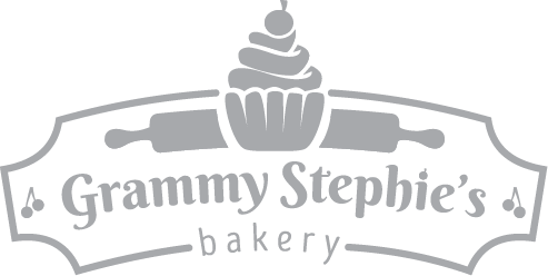

Initial run at the logo had me focused on the rolling pin. For the first option I went with a vintage style sign shape coupled with some baking classics-the cupcake and the rolling pin. I thought the cherries added a sweet touch, but the client wasn't feeling them.
Next go was the continuous line piece above, but I wasn't feeling the way the text stacked. The client liked this one as well but wanted some equal focus between "Grammy" and "Stephie's."
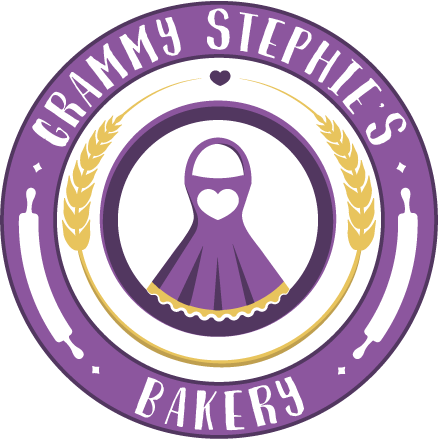
We then talked about heading back to the apron as the centerpiece.
Next go was the continuous line piece above, but I wasn't feeling the way the text stacked. The client liked this one as well but wanted some equal focus between "Grammy" and "Stephie's."
We then talked about heading back to the apron as the centerpiece.
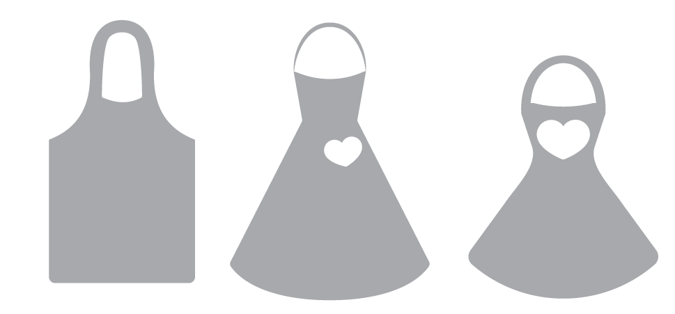
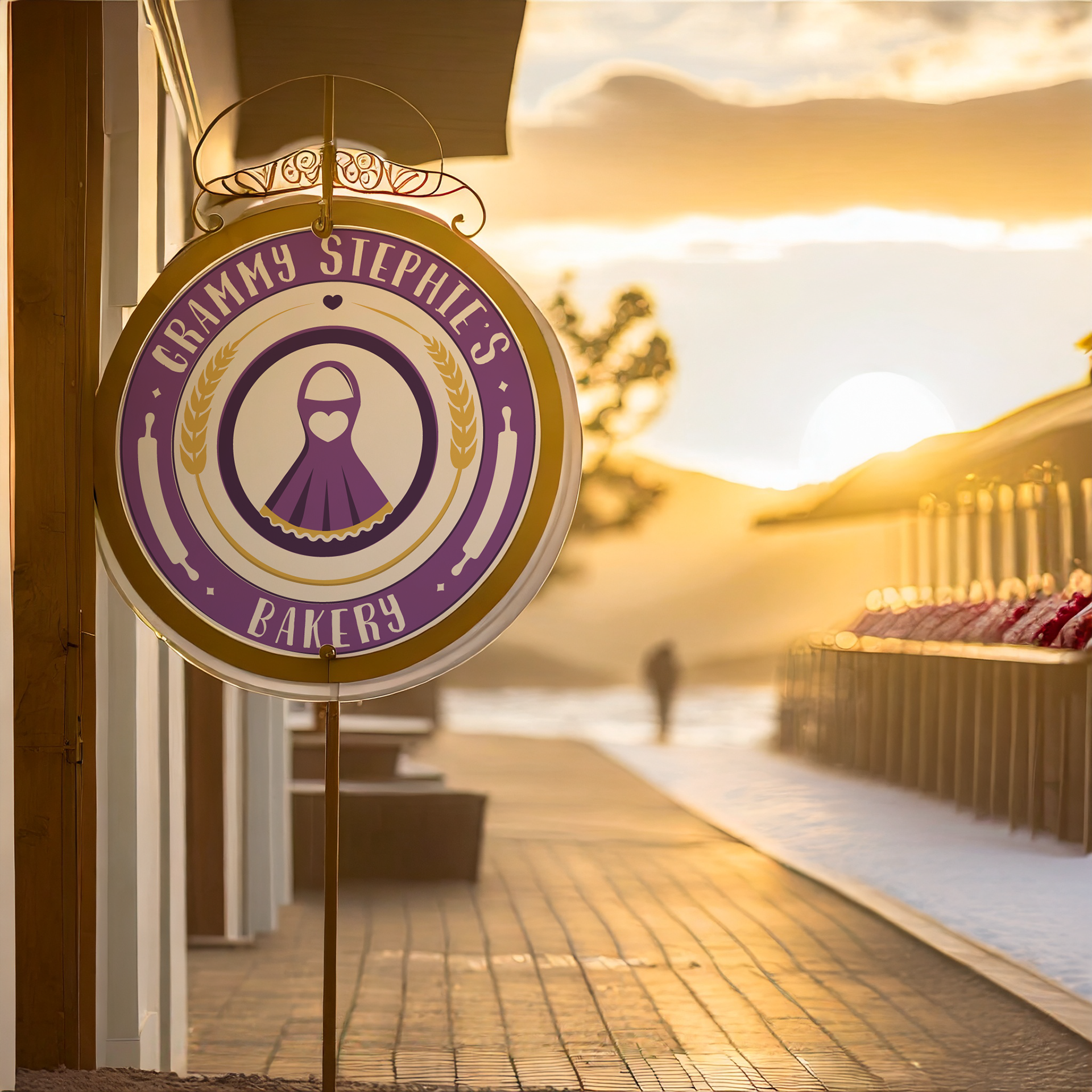
I toyed with a few apron styles, ultimately going with a feminine and simplified style that would play well at different sizes. Later, when worked into the logo, I added a scalloped edge at the bottom of the apron that feels feminine, but also is a nod to cookie cutters and pie crusts.


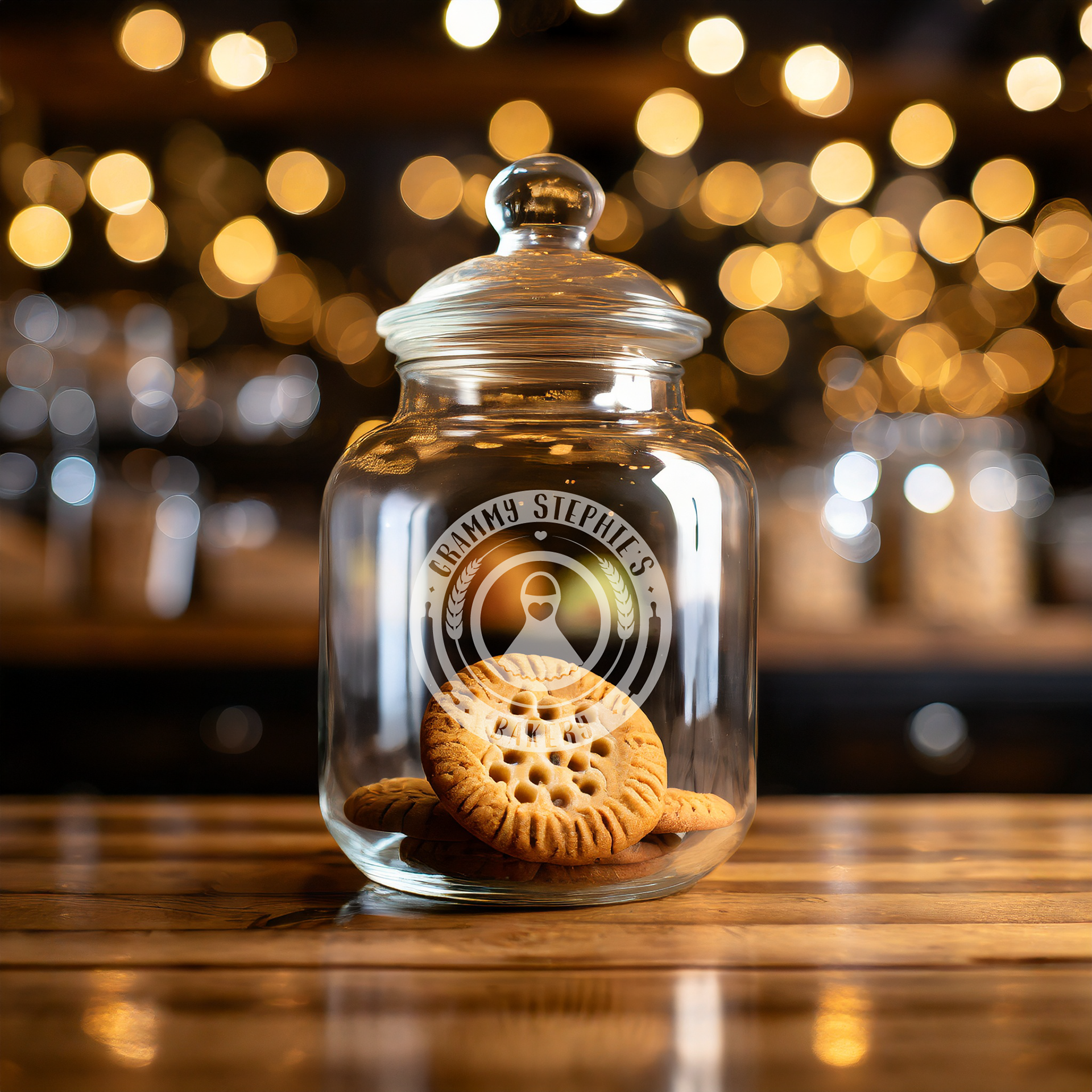
These will act as a simplified version of the logo, used for stickers, small prints, or however the client sees fit.
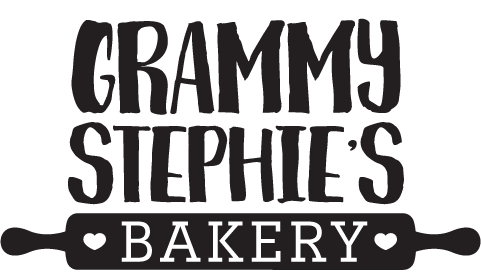
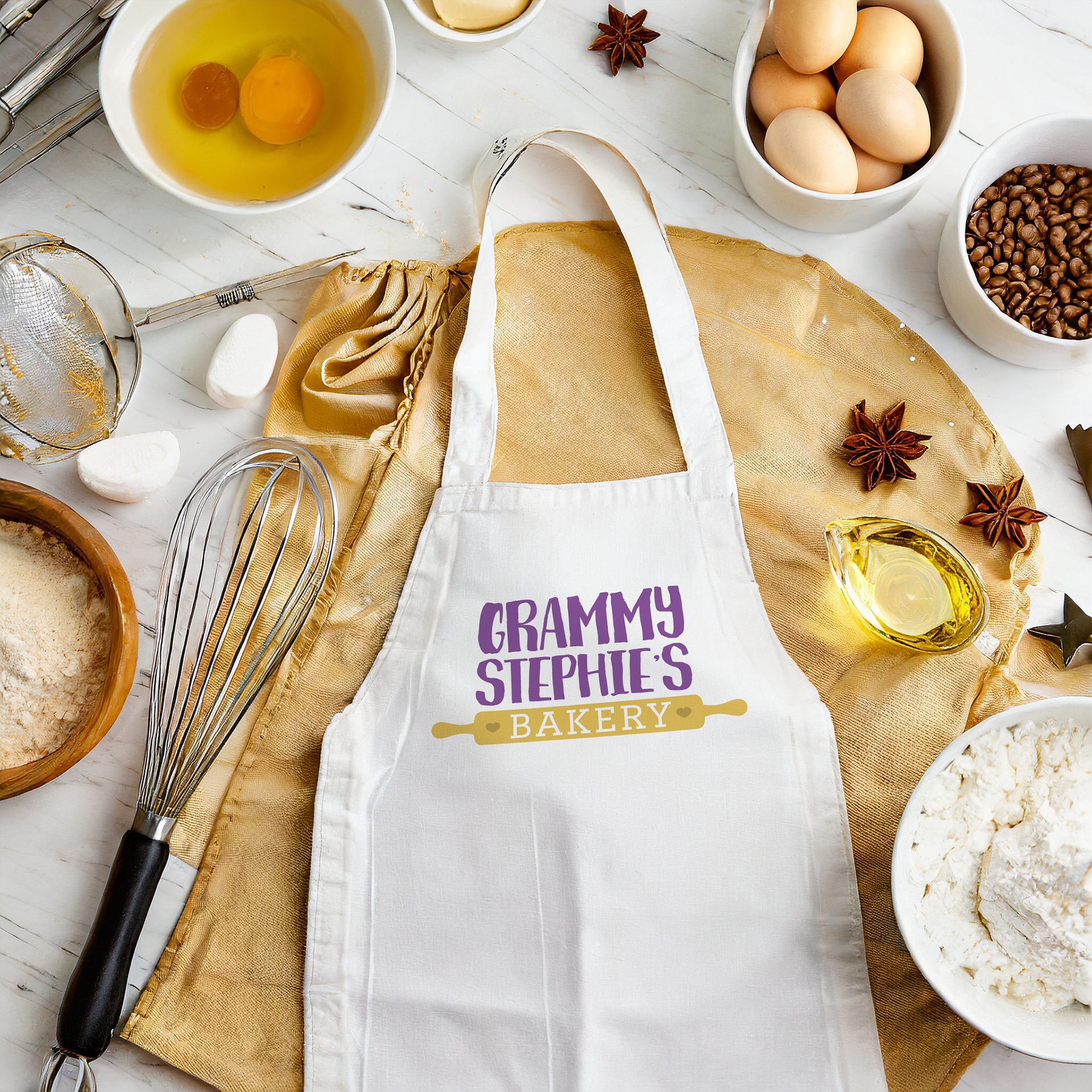
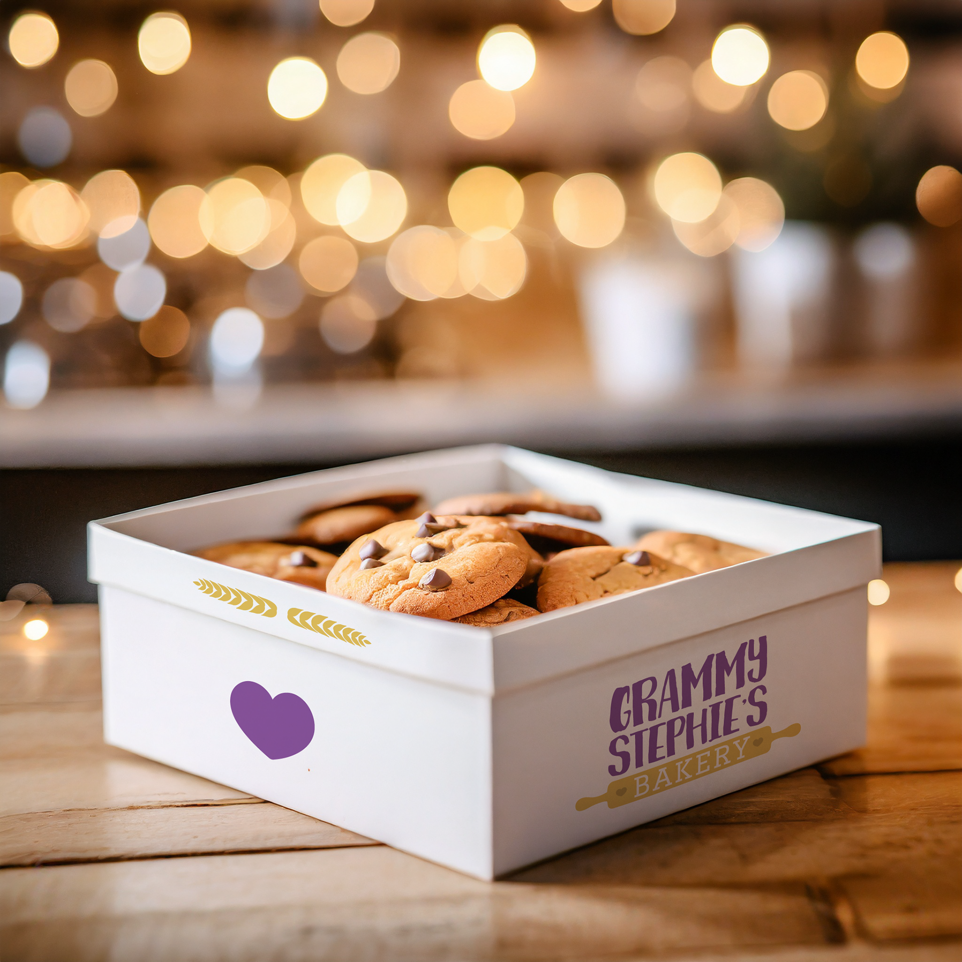
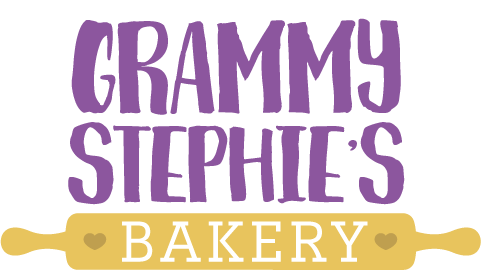
It was also important to create a version that focused on the text and gave the client a more horizontally composed version to use as a header, or for other print collateral as appropriate. Taking the rolling pin and hearts from the full logo, I provided this variation to add versatility to the logo package. Below you can variations and logo assets used in branding mockups.